IndiaTimes
Indiatimes is an online news portal that posts trending stories on politics, sports, entertainment, technology, business, health, and more.
Team & Duration
Rajat Bagga
Karan Dargan
6 Months
August 2016 - January 2017
Role
UI / UX Designer
UI Design, iOS App, Android App, Mobile Web,
Micro interactions
Product Designer
Qualitative Research, Creating Concept, Prototyping, UI/UX, Animation,
Branding
Product Head
Angad Bhatia
COO - Indiatimes Lifestyle Network
Times Internet
Problem
IndiaTimes had a strong user base from Facebook engagements but users usually got confused it to be with or part of “Time of India”, hence needed a strong brand makeover and presence on every platform to target young adults (millennial) age group.
Branding Collaboration
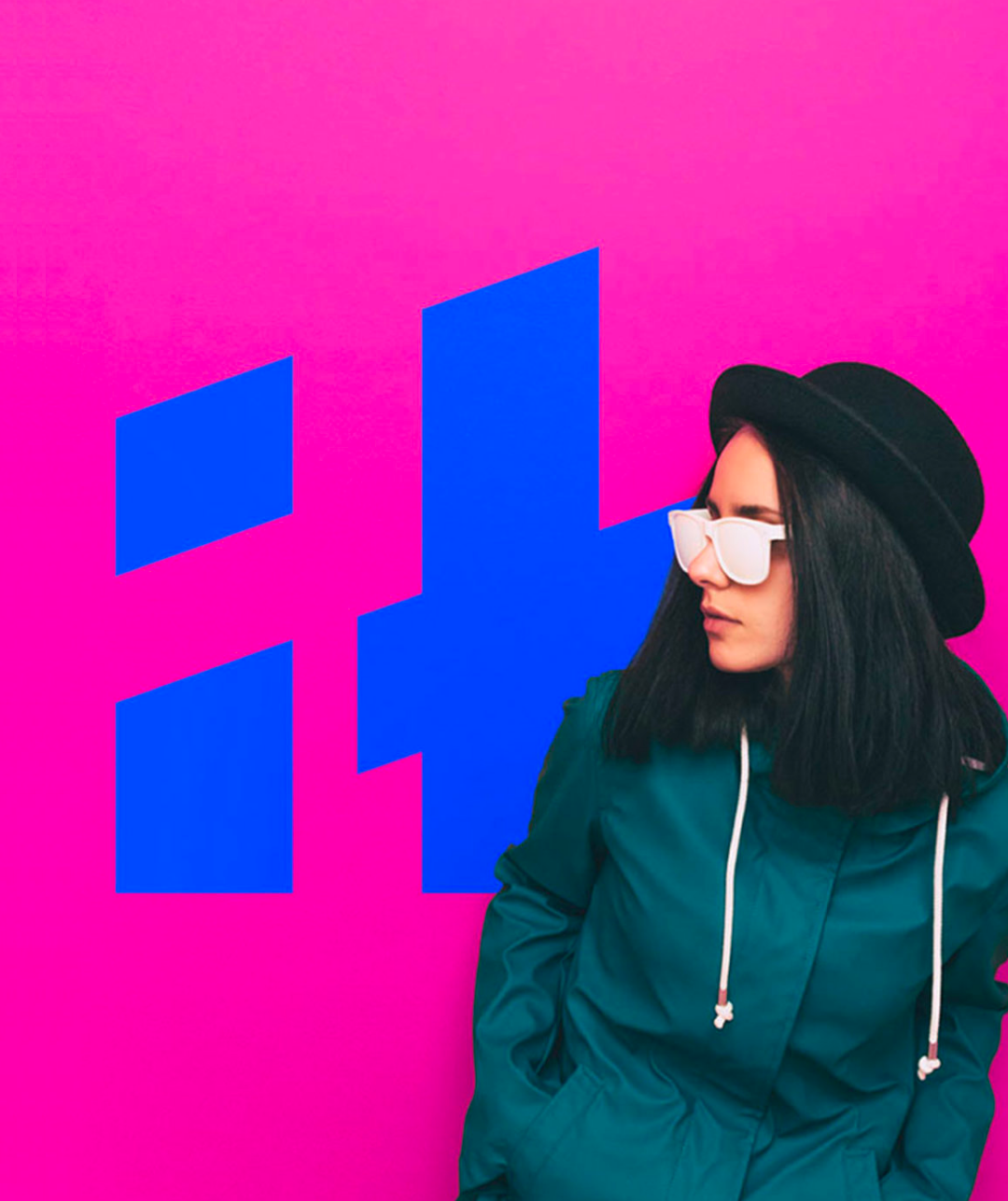
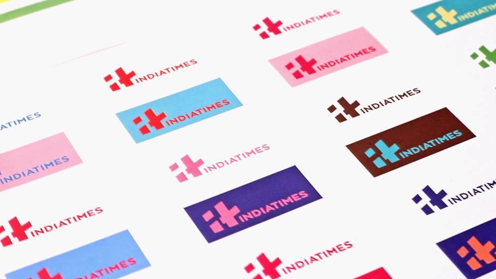
IndiaTimes collaborated with Animal Designs Agency to work on branding elements including Logo, Colors, Illustration, Creatives and Typography.
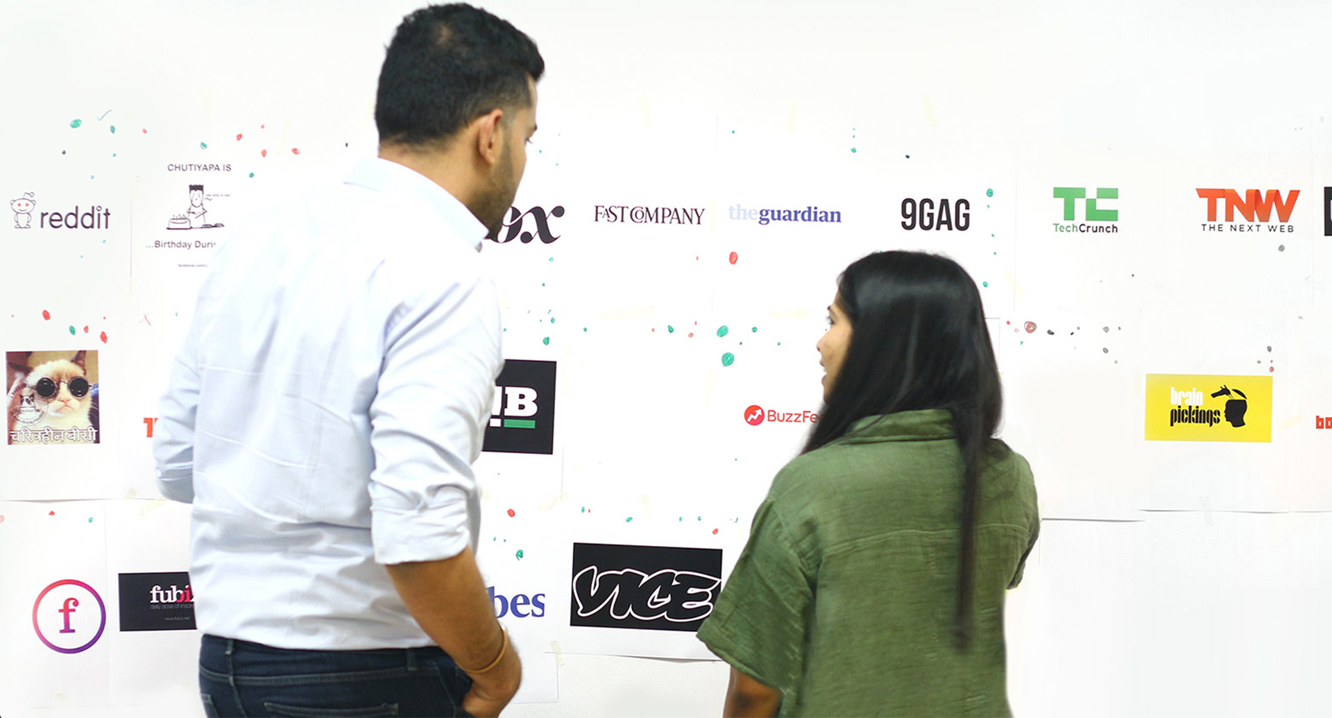
Competetive Analysis
We analyzed all media platforms which have a strong user base and popular among focus group.
-- How these platforms are making their platform engaging?
-- How can we evolve IndiaTimes interface to distinguish from others and provide our unique experience while keeping it familiar?
Cross-Platform
Following are the critical touchpoints for cross-platform experience.
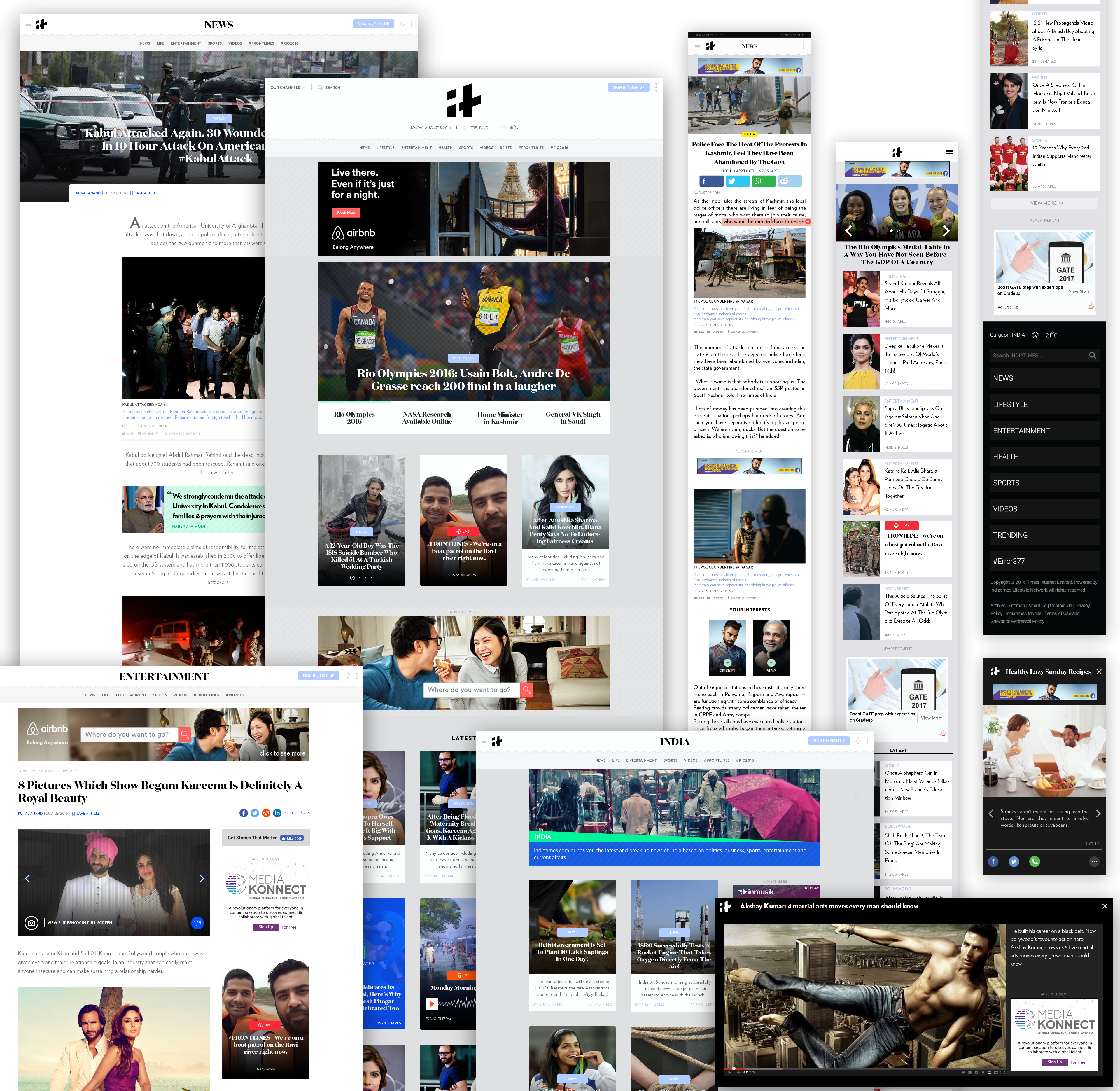
Desktop & Mobile Web
Desktop & Mobile Web
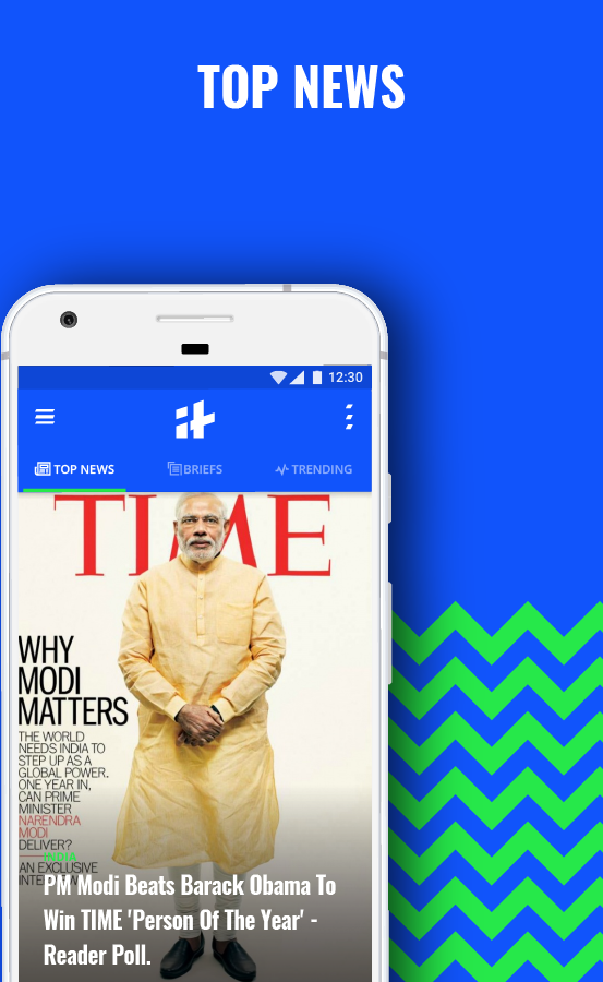
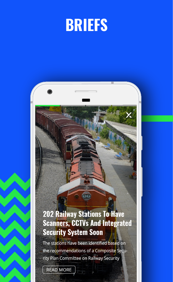
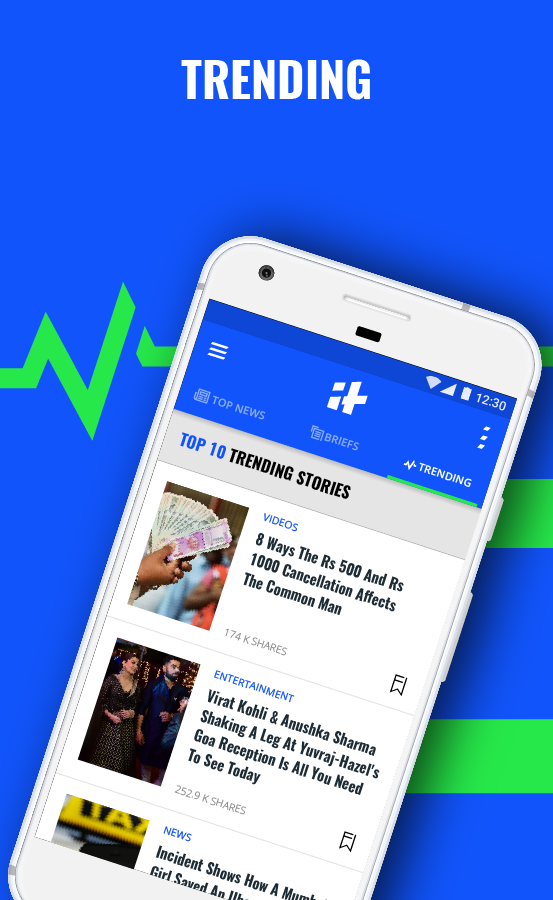
Android App
Android App
Android App
iOS App
iOS App

Facbook Instant Article
Facbook Instant Article
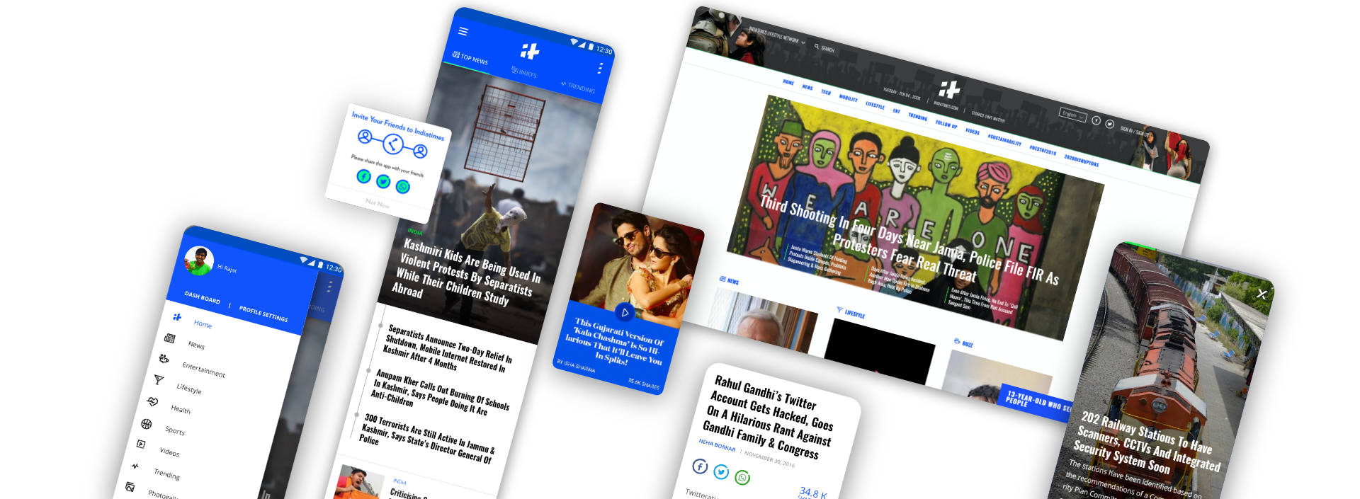
Beta Version
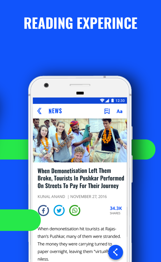
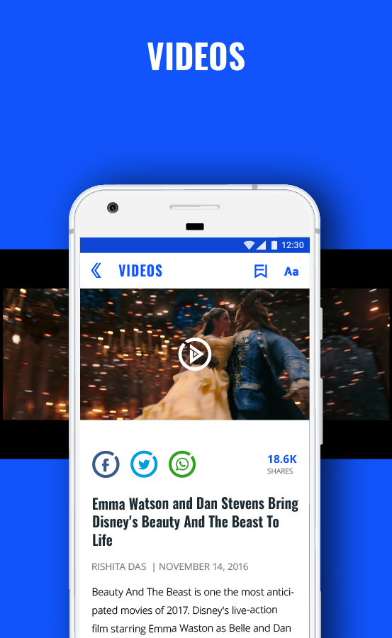
We created a high-fidelity design for all the platforms, based on updated branding and typography.
iOS & Android
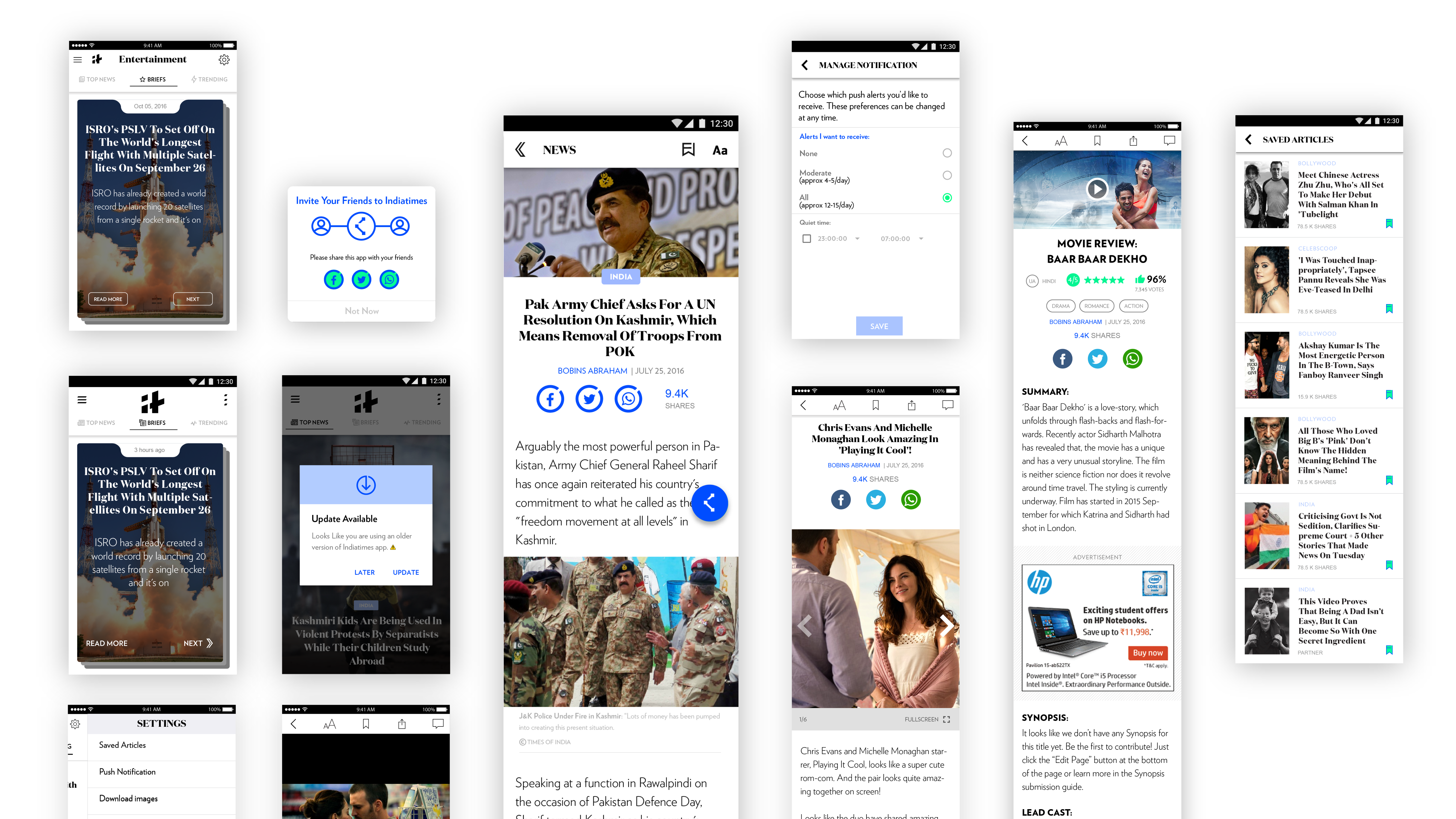
Desktop & Mobile Web
Testing & Feedback
• Branding & UI was very similar to another popular platform.
• Brief section experience was not contributing to the engagement.
• Beta Version design was not exciting enough for ideal brand appeal.
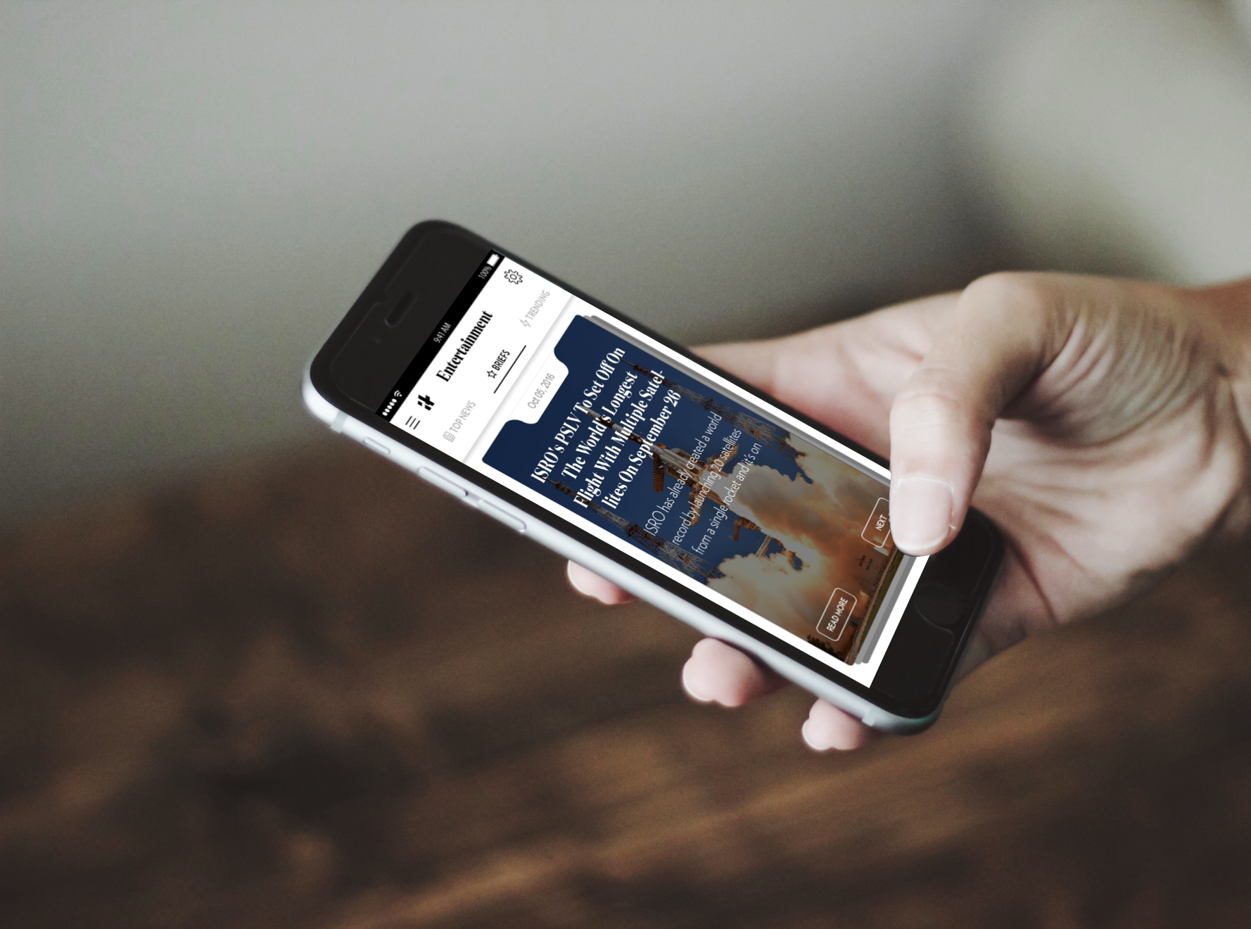
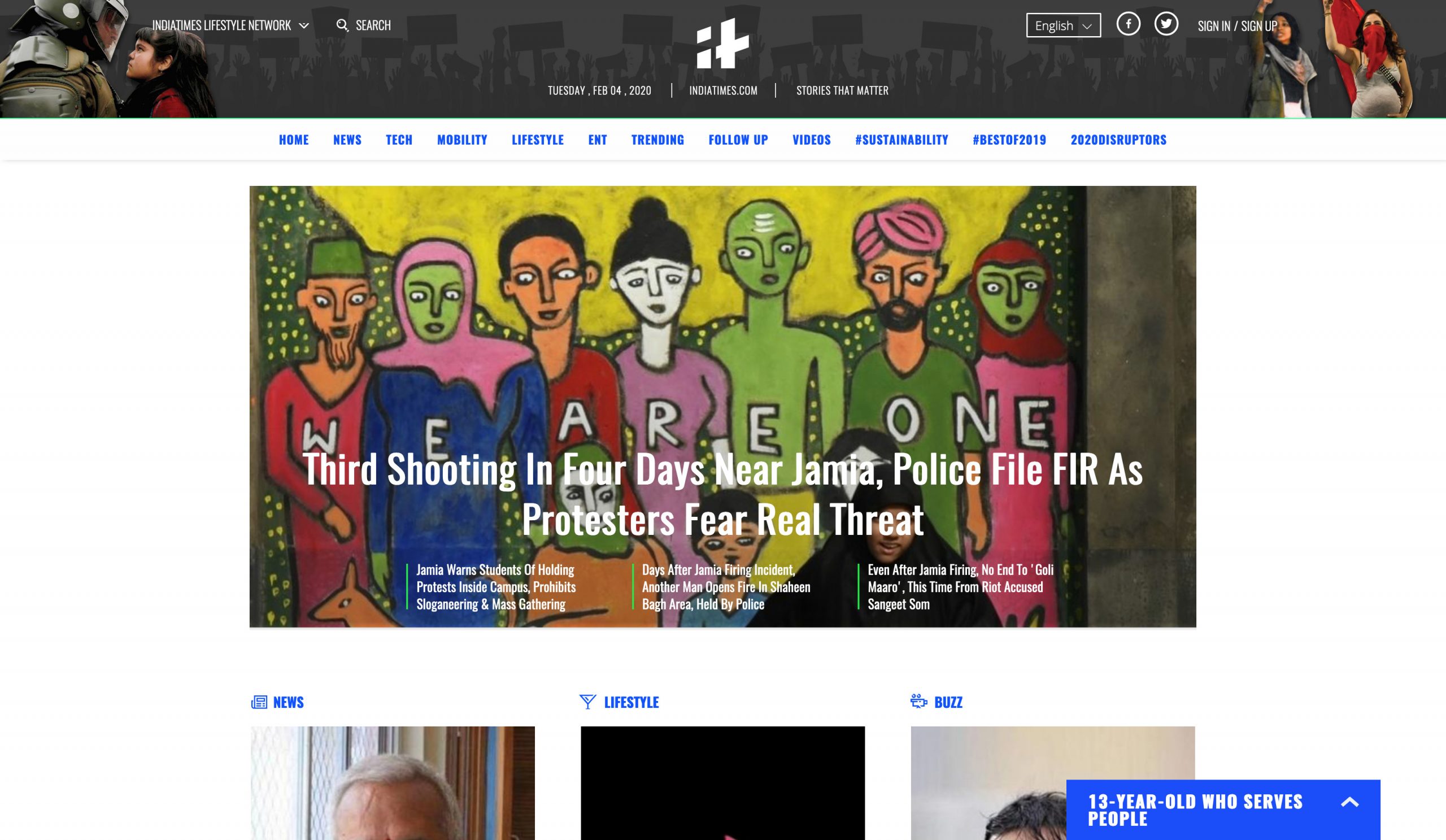
Final Design


🎖
As a major milestone, in December 2016, it also became the largest social publisher on Facebook globally, ahead of New York Times, CNN, BuzzFeed, as well as all other Indian publishers, with over 25 Million social interactions in the month.
As a major milestone, in December 2016, it also became the largest social publisher on Facebook globally, ahead of New York Times, CNN, BuzzFeed, as well as all other Indian publishers, with over 25 Million social interactions in the month.
Reflection
This was my first time to work on a big product and company. I learnt a lot about communication and the importance of the design process. In the approach of establishing a brand, we made compromises with usability. And I learnt that for a platform where reading experience is really important, more time and emergency should be used to work on typography and reading usability.
If working hard on concept ideas, it's important to get proper feedback on them. Without feedback or critique session I was feeling lost in the process, which resulted in low creative confidence.
Get in touch.
I'm currently seeking full-time opportunities.
I'm currently seeking
full-time opportunities.
I'm currently seeking
full-time opportunities.
I'm currently seeking
full-time opportunities.

© 2019 Rajat Bagga, All rights reserved
© 2019 Rajat Bagga, All rights reserved